





Arbor Antiqua
A visual journey between ecology and archaic symbolism
Arbor Antiqua is born from the ambitious development of the corporate identity and web interface for a research project conceived by a collective of university students from Vienna.
At the center of this synergy lies a theme more relevant than ever: deep ecology and the recovery of archetypal values that govern the ancient and visceral relationship between man and nature.
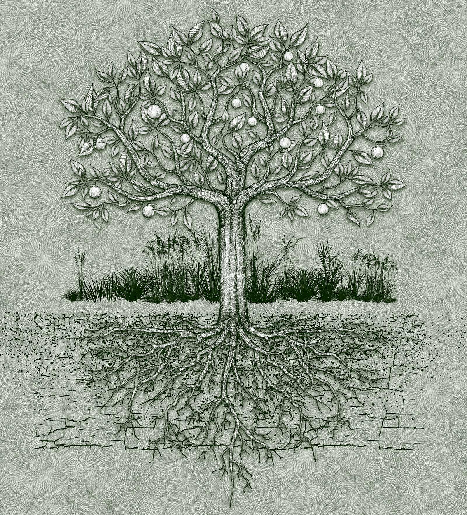
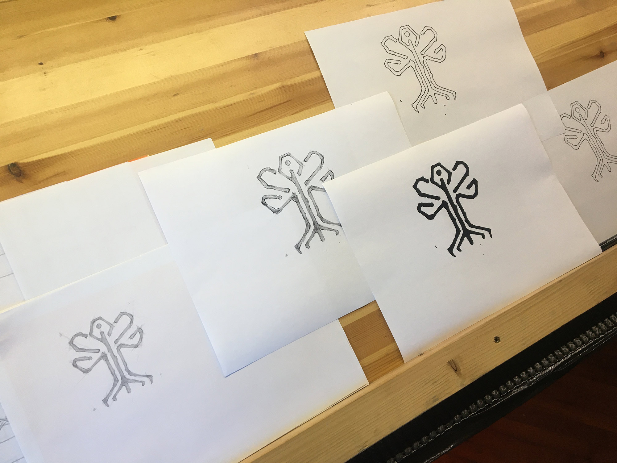
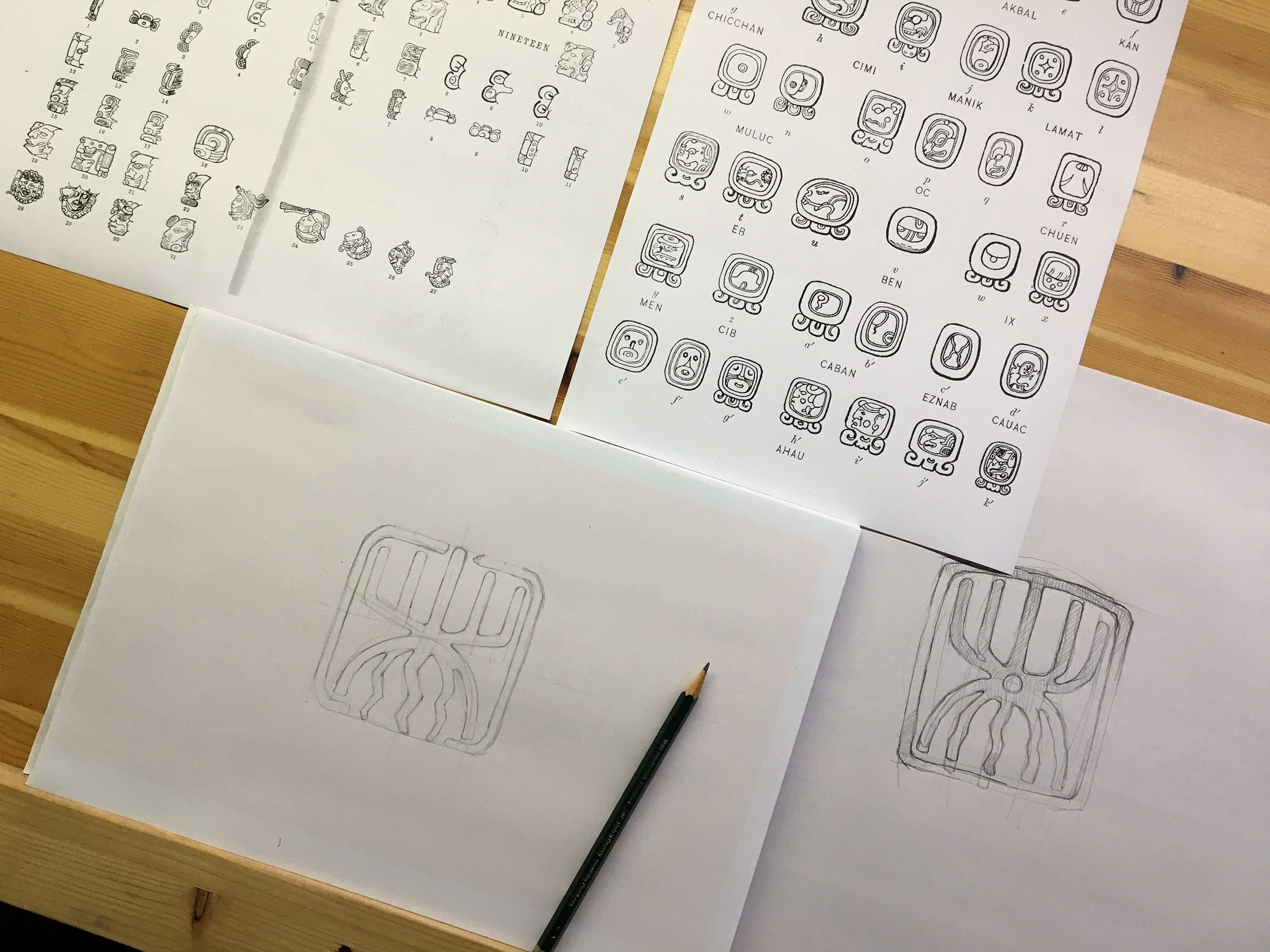
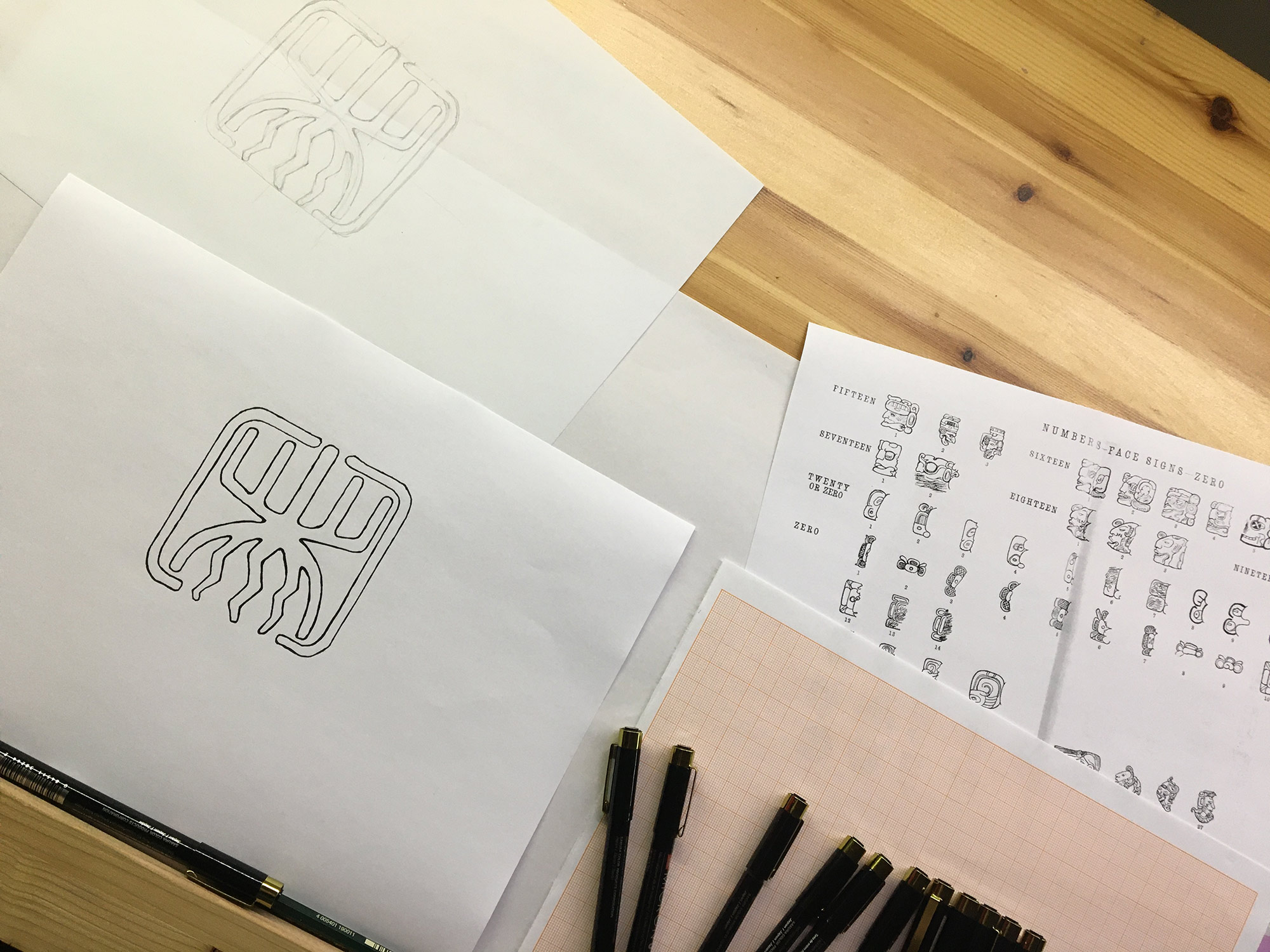
Our graphic studio embraced this vision by exploring the powerful metaphor of the tree, understood as the generating principle of multiple "branches" that extend upward and downward to tell of different aspects of vital existence.
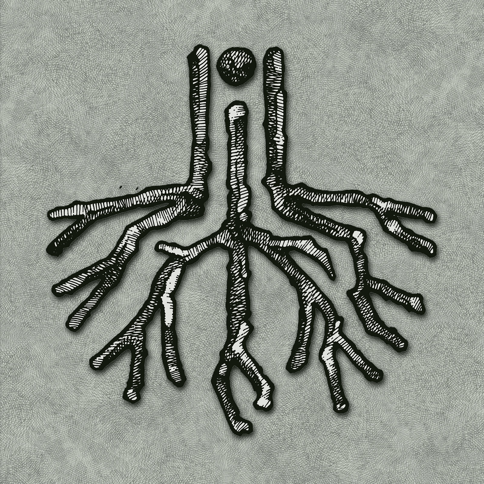
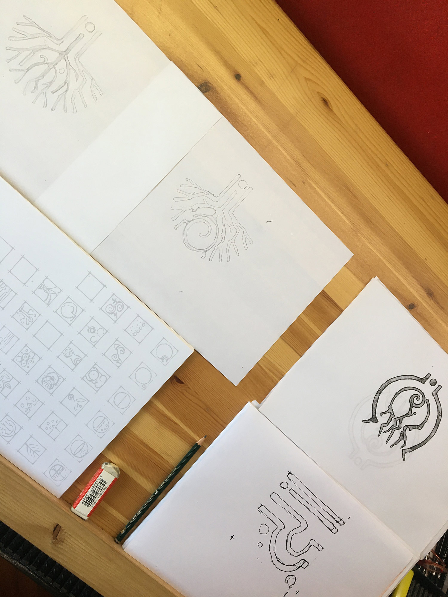
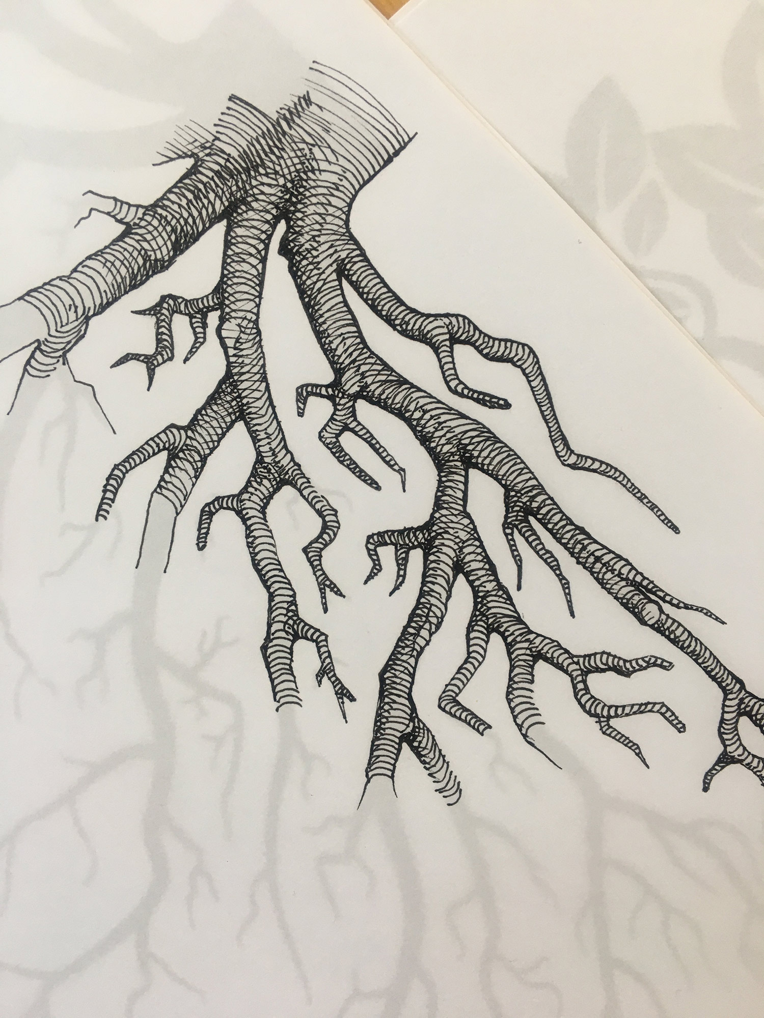
The design thus moves between two complementary worlds: a visible, aerial, and lush dimension, and an "underground", mysterious, and nurturing dimension.
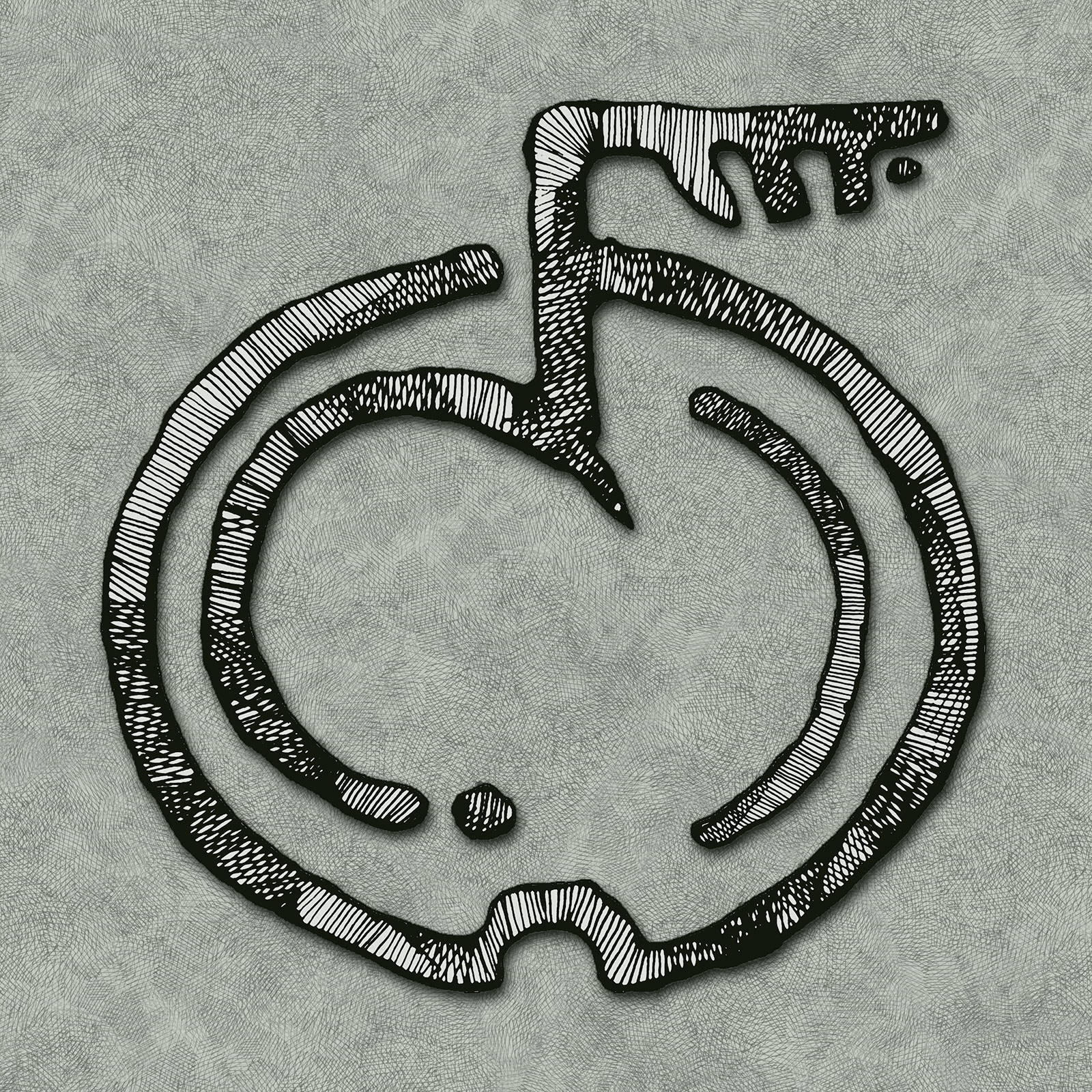
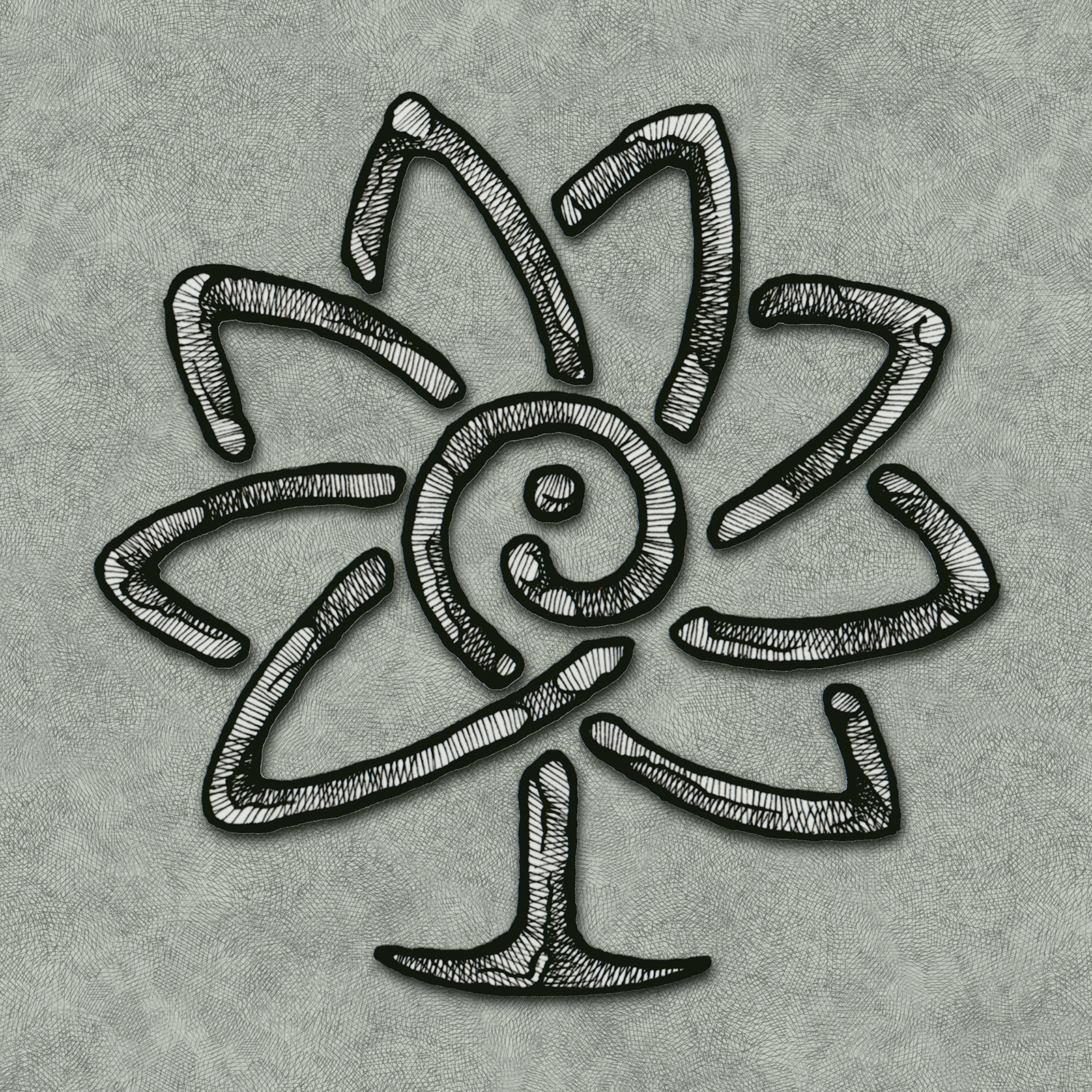
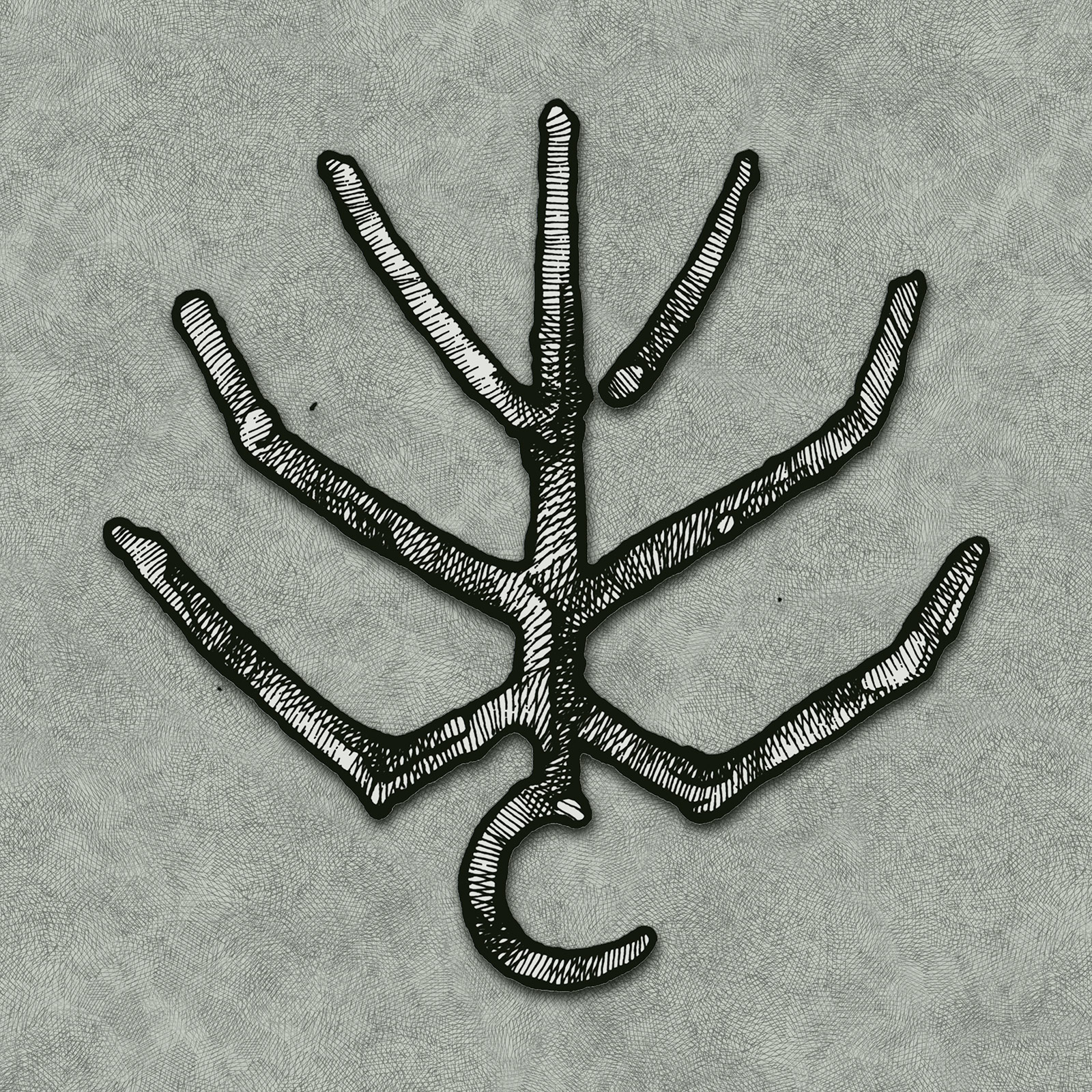
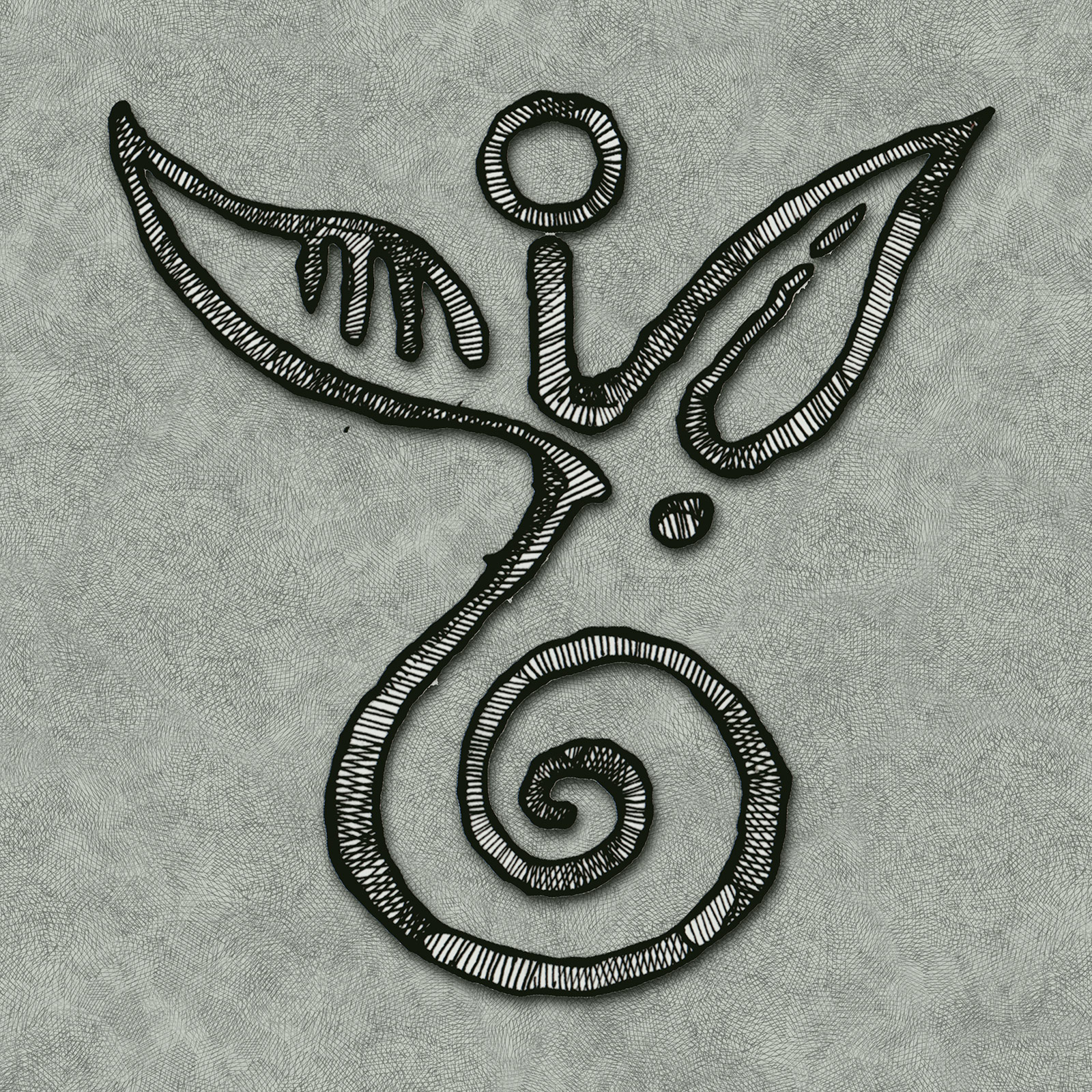
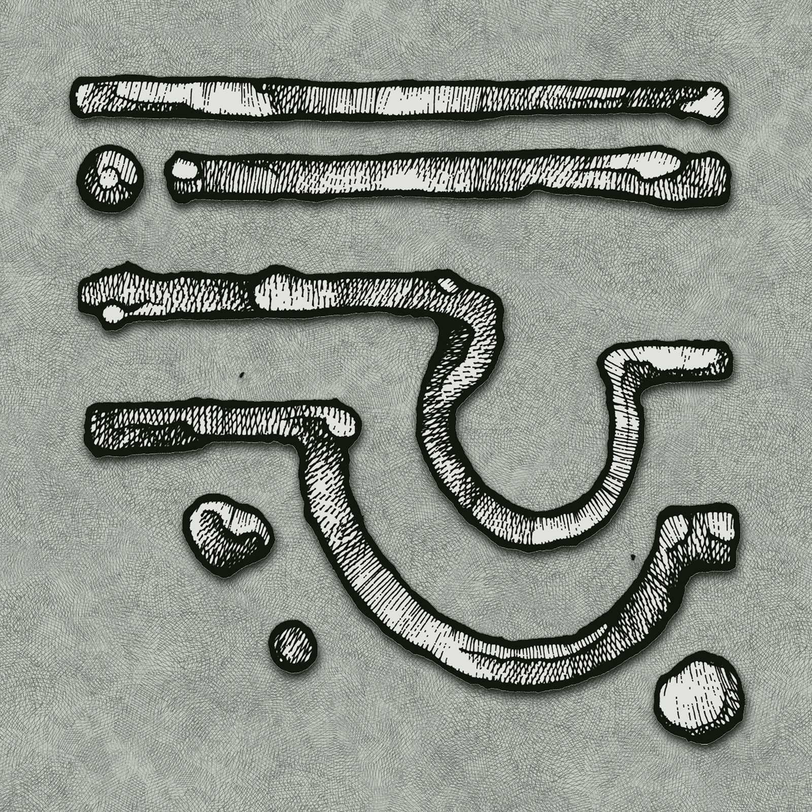
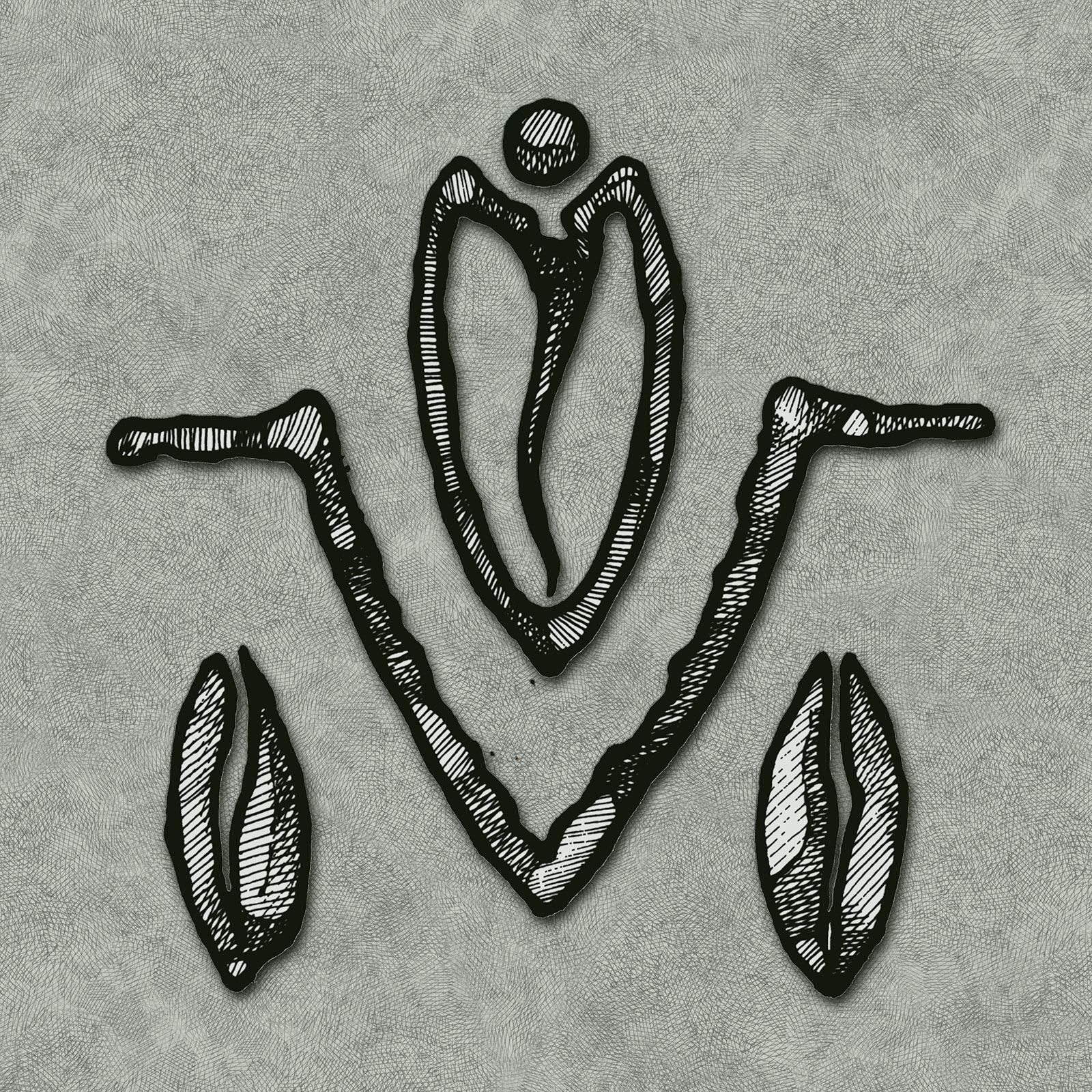
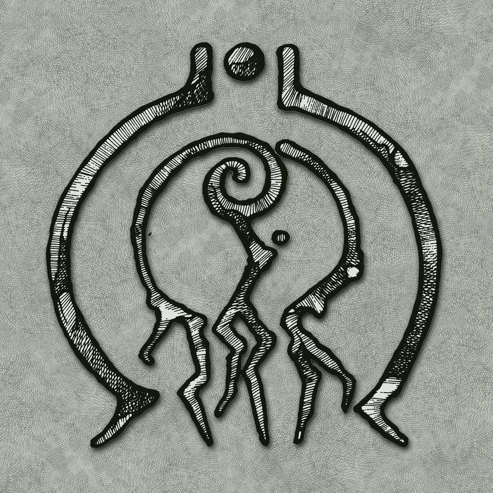
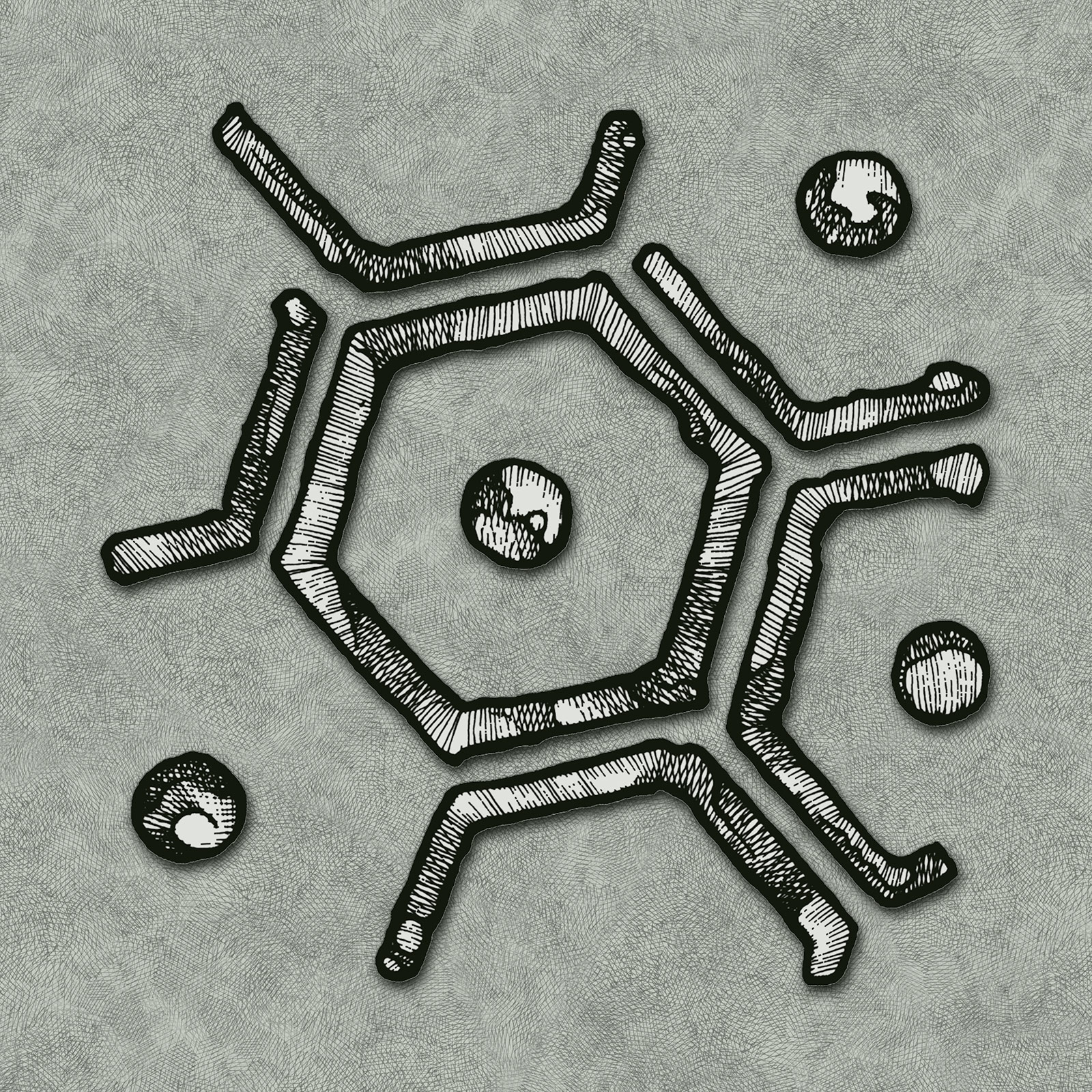
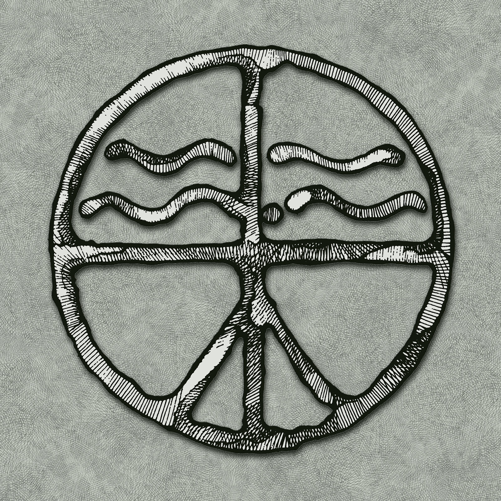
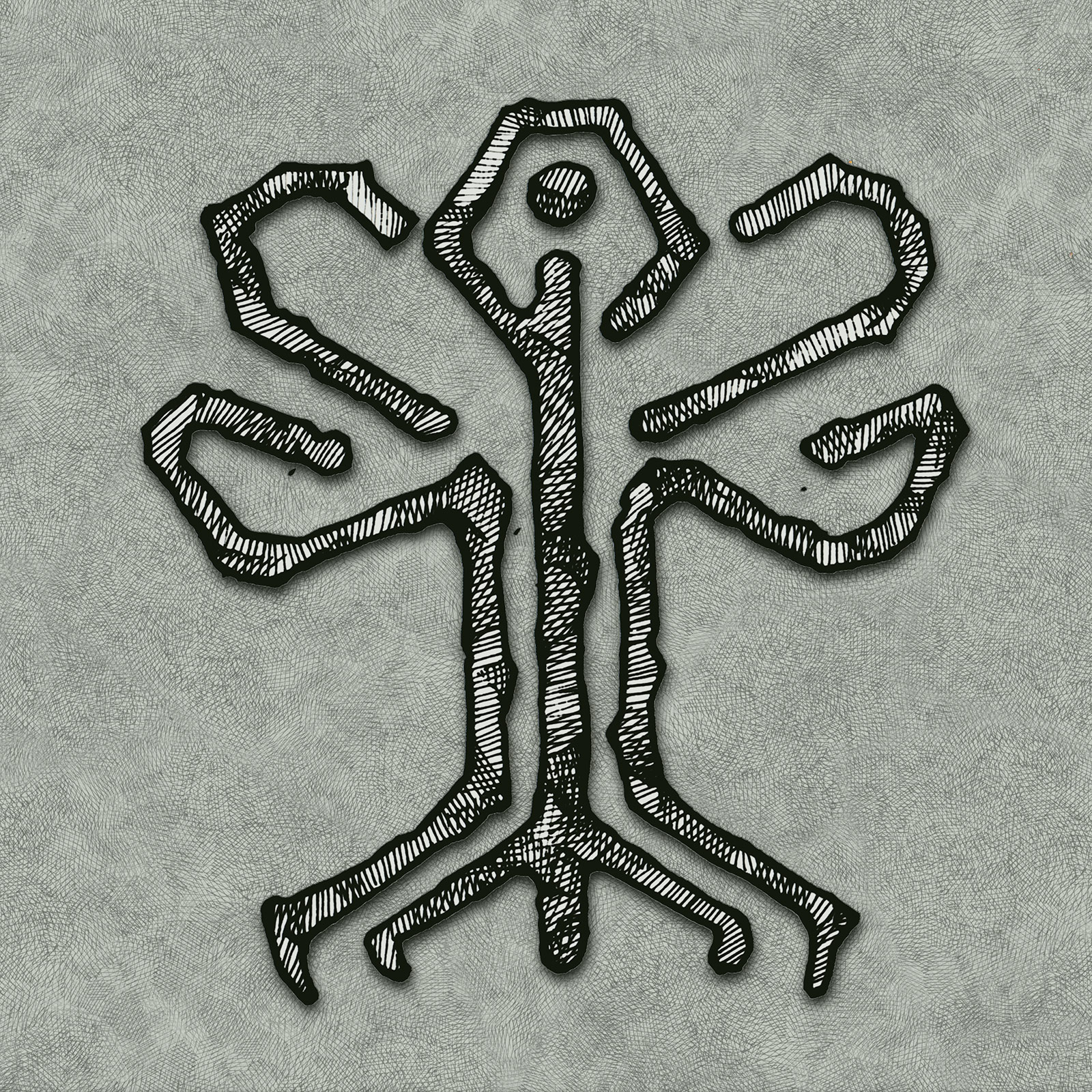
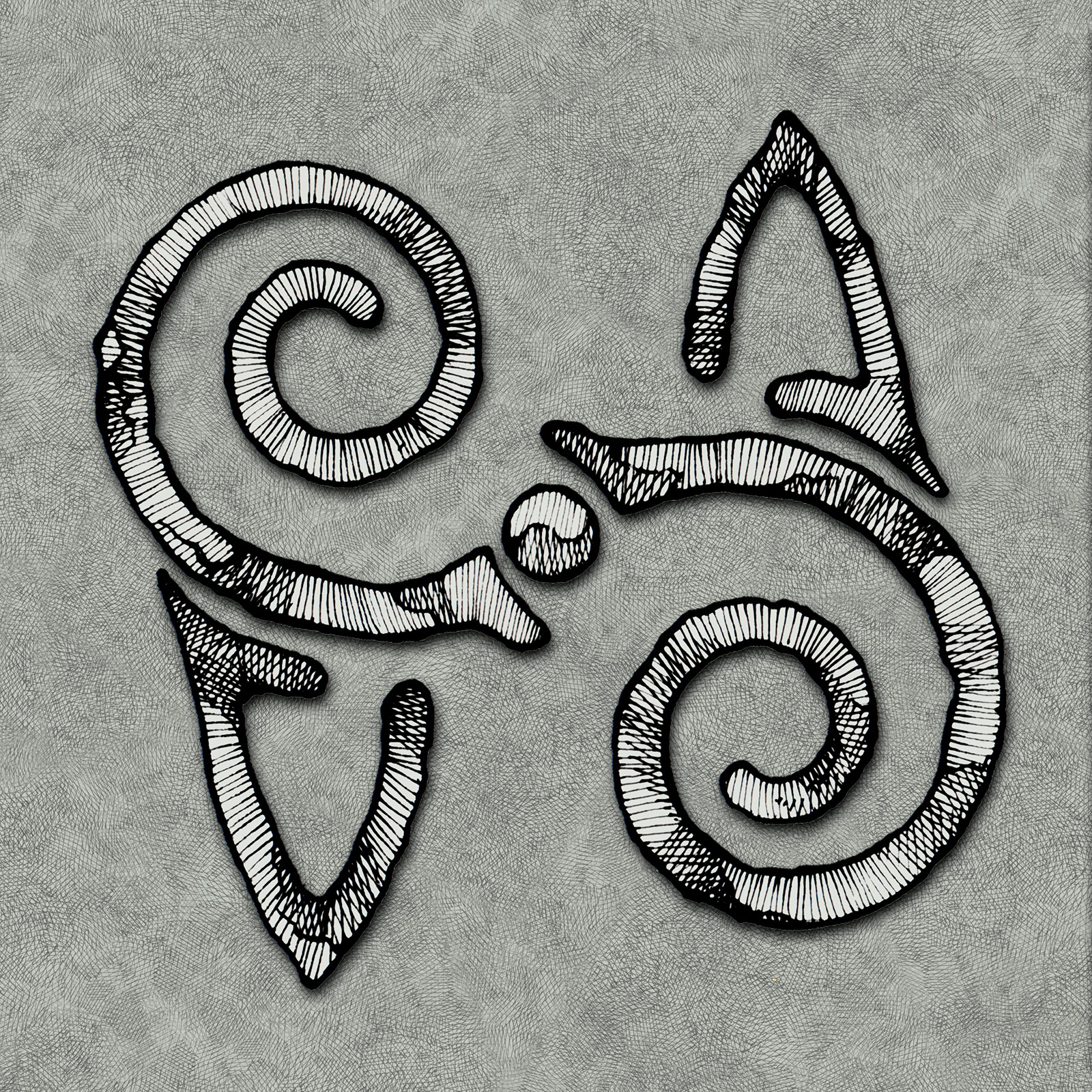
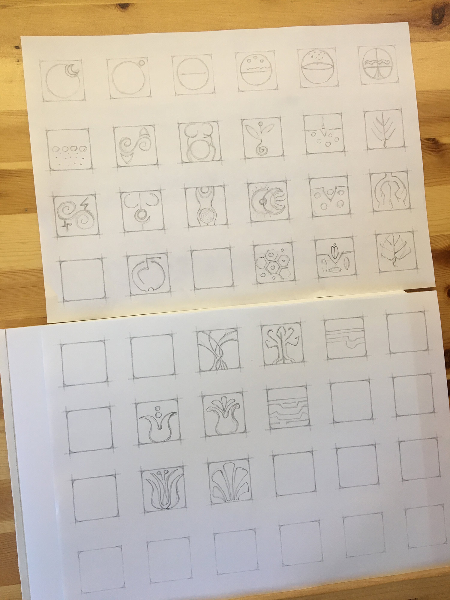
This duality takes graphic form through archaic symbols with a universal flavor: the fruit, the flower, the leaves, the seeds, the sprout, but also the earth, the deep roots, and the micro-structures of plant cells.
The result is a evocative and suggestive collection, characterized by an aesthetic with an almost tribal flavor.
Each visual sign evokes the essentiality and sacredness of rock graffiti.